Sites With Style Home

Category

Design Inspiration

22 articles

Design for the Moment Without Losing the Plot: A Seasonal Refresh Guide

Design for the Moment Without Losing the Plot: A Seasonal Refresh Guide

Slapping a snowflake on your homepage header isn't a seasonal strategy — it's a panic move. But done thoughtfully, seasonal design updates can actually strengthen your relationship with users, signal that your brand is alive and paying attention, and create the kind of timely relevance that keeps people coming back. Here's how to refresh your visual design for the moment without abandoning everything that makes your brand worth visiting in the first place.
Grid? What Grid? The Case for Layouts That Actually Breathe

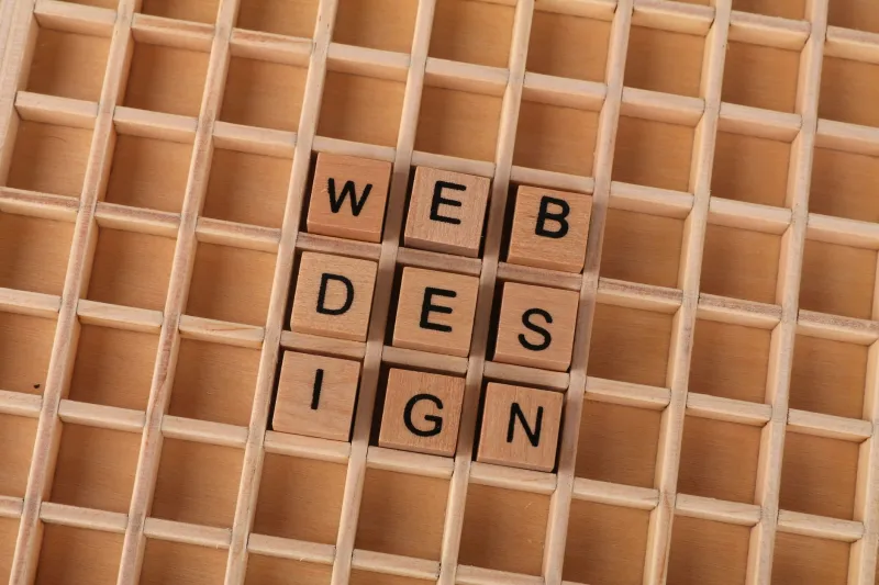
Grid? What Grid? The Case for Layouts That Actually Breathe

The 12-column grid has been the backbone of web layout for so long it's started to feel less like a tool and more like a law. But a new wave of designers — armed with CSS Grid, Subgrid, and a healthy disregard for convention — is proving that structure and rigidity aren't the same thing. Here's what's happening at the edges of layout design, and why it matters for anyone who wants their sites to look genuinely fresh.

Hear This: How Smart Brands Are Using Sound to Make Websites Unforgettable

Hear This: How Smart Brands Are Using Sound to Make Websites Unforgettable

Sound is the design element most websites completely ignore — and that's exactly why it's becoming a competitive advantage. From subtle UI chimes to carefully crafted ambient audio, sonic branding is quietly reshaping how users feel about the sites they visit. Here's what the pioneers are doing right, what the cautionary tales got spectacularly wrong, and how to approach audio design without driving your visitors absolutely crazy.

The Slow Reveal: How Luxury Brands Are Weaponizing Load Time

The Slow Reveal: How Luxury Brands Are Weaponizing Load Time

Premium brands are deliberately slowing things down — and it's working. Cinematic transitions, staged content reveals, and choreographed loading states are quietly becoming the new hallmarks of high-end web design. Here's why the most expensive-feeling sites on the internet aren't in a hurry.

Slow Down to Speed Up Trust: The Case for Intentional Friction in Web Design

Slow Down to Speed Up Trust: The Case for Intentional Friction in Web Design

Instant isn't always better. Some of the most trusted digital experiences on the web quietly embrace deliberate pacing — and it turns out that a little thoughtful friction goes a long way toward making users feel confident, not frustrated. Here's why slowing down might be the smartest move you make.

When Rules Become Your Secret Weapon: The Creative Power of Design Constraints

It sounds counterintuitive, but the best design work often comes from the tightest limitations. From strict column grids to a single-font rule, constraints don't cage creativity — they channel it. Here's how embracing intentional restrictions can push your next project from good to genuinely great.

Small Moves, Big Impact: How Micro-Interactions Turn Passive Visitors Into Engaged Users

Small Moves, Big Impact: How Micro-Interactions Turn Passive Visitors Into Engaged Users

The difference between a website that feels alive and one that feels like a PDF often comes down to the tiniest details — a button that pulses, a checkbox that celebrates, a menu that glides. Micro-interactions are the secret sauce behind the most beloved digital experiences, and understanding them can completely change how you approach design. Here's why small is powerful, and how to use motion with intention.

Color Is Your Loudest Design Decision — Here's How to Get It Right

Color Is Your Loudest Design Decision — Here's How to Get It Right

The colors on your website aren't just decoration — they're doing psychological heavy lifting every single second a visitor is on your page. From boosting conversions to building trust, your palette is one of the most powerful tools in your design arsenal. Here's how to wield it with intention.

Designing for Thumbs: The Mobile-First Mindset That Doesn't Wreck Your Desktop

Designing for Thumbs: The Mobile-First Mindset That Doesn't Wreck Your Desktop

Mobile-first isn't a trend anymore — it's the baseline. But too many designers treat it like a constraint instead of a creative challenge, ending up with sites that feel dumbed-down on big screens. Here's how the smartest teams are building for thumbs without leaving desktop users out in the cold.